Wednesday, February 28, 2007

Start With a Gesture


...A gesture drawing, that is!

Most of us know about gesture, and if you have studied art, remember doing gesture drawings back in college or art school, but have you continued to keep them a part of your practice?

A gesture drawing is a very quick (one minute or less, generally) drawing that captures what a figure or scene is DOING, rather than the space it takes up on the page. In a gesture drawing, you would concentrate on the reach of an arm, the feeling of weight on one foot, the bend of the trunk of a tree, etc.

In one of my very favorite art books, Kimon Nicolaides' The Natural Way to Draw, he talks about gesture through the entire book. Here is a great quote about it's use:
The focus should be on the entire figure and you should keep the whole thing going at once. Try to feel the entire thing as a unit- a unit of energy, a unit of movement. Sometimes I let new students begin to draw on a five minute pose, and then, after one minute, ask the model to step down from the stand. The students stop drawing with surprise. I tell them to go ahead and draw, that they had started to draw and must have had something in mind; but usually, they are unable to continue. The truth is that they had started with some little thing, such as the hair, and had not even looked at the pose as a whole. In the first five seconds you should put something down that indicates every part of the body in the pose. Remind yourself of this once in a while by limiting a group of gesture studies to five or ten seconds each.

Gesture drawings are best done on larger pieces of paper- newsprint pads are great. Use a conte' crayon or charcoal and work loosely, letting your crayon travel on the page as your eyes take in the whole form and what it is doing. Don't get hung up about how it looks. This is more of an exercise for your brain than it is for your hand. If you begin with a gesture drawing and can keep that energy throughout your drawing or painting to completion, you will have something that BEGS to be looked at, because the energy of movement will draw people to it. But for now, we are taking baby steps with short gesture drawings.

Try some today! We will be developing gesture over the next few days, so get some practice in today on a few quick gesture drawings.

Today, practice a few of these gestures from life. These are easy to do in public on mid-size paper, because they are fast, and no one will realize what you are doing. Pets and family members also make good models.

Tuesday, February 27, 2007

Study First!


Today, I'd like to share a little bit with you about the value of doing studies before beginning a painting or drawing that you will be investing a longer amount of time developing.

Don't worry, it is not nearly as painful as getting ready for an exam! It's actually fun, believe it or not, and a great day to get your creative ideas flowing. In addition to looking at the values that are already apparent in a scene, you can add and change values around so that they look even BETTER than what you are actually seeing. It is one of the great things about being an artist. YOU get to choose how to portray your vision.

Studies are great to do in your sketchbook or art journal. I usually start with a value study that is true to the scene- blocking in the range of lights and darks that I actually see, in large areas first- no detail at this stage.

These types of studies can be quick or more developed, but I generally spend between five and fifteen minutes on a basic value study. It is just a tool, and not generally very striking on its own.

Next, I will do a second value study, but this time, will edit reality to my liking. I might add some additional dark areas to balance out the composition, or move things a round a bit. It is a little like making a map at this point, and you are moving puzzle pieces around until you like what you see.

Once I get to that point, I will do a bit more detailed value and developed gesture drawing of the scene, like you see above (about 30 to 45 minutes, give or take). We will begin going into the power of gesture tomorrow, but for now, look at the values in the drawing, and how they relate to the final watercolor painting below.

I am out all morning today, but when I return, I will try to locate my original value sketches for this painting, so that you can see what they looked like in the early stages, or I will re-create them for you and revise the post. This will get you going for now.

Why don't you take something you'd like to paint or draw and try the techniques described above as a way to start. There are two reasons why this tends to keep life in your work- first, you are really looking at the full range of lights and darks and are beginning to use them to your advantage as you plan your painting. Secondly, after you have drawn the scene a few different ways, your brain relaxes, and you can get right to the creative part when you begin the actual painting.

Try this, and I think you'll find that "study"ing (in art) really pays off!

Monday, February 26, 2007

Weekly Theme-Put Life into Your Art!


This week's theme is about how to make your art more vibrant and alive, and therefore, make it more exciting to both make and view.

This topic, more than any other in art, has become my biggest motivator for teaching. My work in years' past, though fairly succesful, lacked an energy about it until just a few years ago, when I began being mentored by an artist who changed my life in terms of how I approach my art. She introduced me to the book, The Art Spirit, by Robert Henri, and also had me follow Kimon Nicolaides' excercises in The Natural Way to Draw, among many other techniques during the years I worked with her. I continue to strive to bring the principles of "The Art Spirit" to my own work.

It was Henri's book and his philosophy that I have taken to heart as an artist, and with the excellent guidance I experienced with my art mentor, it has transformed my work. I will try to encapsulate some of the most important messages and techniques that I learned over the past several years about keeping motion, spirit, life and gesture in the work that we create as artists, and share it with you in my blog posts this week.

This week, we will begin with the concept of value, go into the dynamics of gesture and line mid-week, and add brush strokes and mark-making techniques to finish out the week. Hopefully, by next Sunday, you will have an idea of how to go farther with these techniques to add life to your work, and will continue to explore their potential as your work progresses.

Today, let's look at the concept of value. It is truly a very uncomplicated subject- just lights and darks working together to make a piece appealing. But understanding how to master value is one of the most important fundamentals of art, in my opinion, and is one of the most daunting to new artists.

Almost every new artist I have ever seen, begins with a great fear of value, even if they are not able to articulate that fear. Marks on the page are light and tentative. They are afraid to "mess up," so the impressions they make on the page are barely there.

Even more accomplished artists will only be able to progress so far, if their work lacks a full understanding of how to utilize value.

As an example, I would like to use a watercolor and pen and ink painting I did of Prague Fountain (photo above), the original reference photo contributed here in the Wetcanvas! Reference Library, and featured the week of 2/4/06 in the Weekly Drawing Event, part of the All Media Art Events Forum (highly recommended!)
In the painting at the top of the post, you will see how I tried to bring more life to an already beautiful photograph, using a variety of techniques, but especially darkening values. If we look at just value alone, you can compare the painting above to the photograph to see where I made changes, in hopes of making the scene more dramatic.

If you have photo editing software, you can take an original photo and deepen the darks and lighten the lights to view the dramatic changes that you can create before you begin to draw or paint it. If you work from life alone, do value studies first (more on this tomorrow!) to see how you can use the value changes to your advantage and make your work pop off of the page.

The last thing I will do here today to illustrate this topic, is to lessen the contrast and equalize the values of my painting, so that you can compare it to the version at the top of the post. Doesn't this version look anemic in comparison?


Now, try a drawing or painting today, and don't be afraid to put in those dark darks and white whites! A full range of values will make your work much more powerful!

Sunday, February 25, 2007

The Shapes of Spring


I'm inspired today at the feeling of Spring coming and Winter departing, and thought I'd work it into our mini-challenge relating to our weekly theme of shapes in art.

If it is still cold and miserable wherever you may be, perhaps looking at a glimpse of Spring might make you feel better for the time you are making art today. Making art always makes me feel better about EVERYTHING, so it especially works when I'm cold and stuck inside. But today, as I look outside my window at my lemon tree, heavy with fruit, and fuschia colored azaleas covering my bushes, I am really into the idea of Spring- and flowers!

Two well-loved artists used flowers a great deal in their work, and both really exploited the boldness of color -and especially shape- of flowers. Of course, I am talking about Georgia O'Keefe, with her larger-than-life contemporary flower portraits and their wonderful shapes, and Vincent Van Gogh, with his crazy-beautiful views of irises and sunflowers. Who could look at the flowers painted by either of these artists and not feel something wonderful? (Well, I may be a bit biased, as these have been two of my favorite artists since I was a young girl, but just go along with my bias for this little post...)

Here is a simple quote I found by Ms. O'Keefe, that I thought related to the topic today"
I found I could say things with color and shapes that I couldn't say any other way--things I had no words for.

See! Georgia (may I call her Georgia?) knew the power of shapes, and you can follow her lead and be inspired to do the same today with your art.

Above and below, you will find two of my photos of flowers that you can work with today in your drawings or paintings. Look for the positive and negative space and how you can make the composition interesting by exploiting it. Look for the repetition of shapes in the petals. If you are reading this post for the first time today, look back to the other posts this week for additional posts relating to this one. We have spent our entire week focusing on shapes in art and how to use them to make our work stronger, with individual lessons and focus on how to do it. (Tomorrow starts a new weekly theme!)

Here are some links to flower paintings done by Van Gogh and O'Keefe (See Bella Donna, 1939) for you to take a look at, and inspire you.

Get drawing or painting, and have fun today working with the shapes of Spring!

Saturday, February 24, 2007

Putting it Together-Shapes


We're almost to the end of our week focusing on shapes and how we can use and manipulate them in our work to create more powerful art.

Today, let's put some of the concepts we looked at this week together to work, and see what we can do with them.

Earlier this week, we looked at the shapes that can be made in positive and negative space, repetition of shapes in artwork and how to use them to your advantage, turning reference work upside down or sideways to see the subject in terms of shape better, abstraction of reality by using shapes as a starting point and more.

Here's an idea to try today- take a photo or a scene that you'd like to use as your reference, and divide a page in your art journal or sketchbook into three or four sections. Then try a few different approaches that we discussed this week in the different areas. You can use your artistic license to decide how you'd like to proceed, and have fun with it!

In my example, I worked from an old photo of the silent film starlet, Gloria Swanson. (After all, it's Oscar Night tomorrow night!)

You can see how I experimented with exaggerating parts (like the hand in the first drawing) and with the placement of the shapes that made her up within each section of the page. I tried different papers and media, too. Which one do you think worked best??

Give this idea a try, and share it with us here!

Friday, February 23, 2007

Say it Again...and Again...and Again

Today, let's look at the power of repeating shapes or patterns in art. Some art can be *ALL* about the repeating shapes and take on a graphic quality (think of some of MC Escher's work
or Mondrian's color blocks). outside the world of fine art, think of the practical items that we use with repeating shapes to make our homes and lives more pleasing- symmetrical designs in rugs, patterns in quilts, and repetition of shapes in bolts of fabrics and even our clothing all come to mind.

Think back to earlier this week when we looked at one of Van Gogh's self portraits together. He didn't use an obvious pattern, but used the shape of the triangle many times in the same painting, to make his work more powerful.

Our mini-challenge today is to draw or paint something with repeating shapes that show up as a pattern. You can do something like Escher- with a flat interlocking shape, or simply find something in your world that has the same shape that repeats several times and utilize it in making an interesting composition on your page.

I think it would be great to work from life for this challenge, if you are able, but to illustrate repeating shapes, I am including a few of my photos and art for you to take a look at. Try this out! And let me know what you are working on or thinking about this week as you make art.

Thursday, February 22, 2007

The Positives of Negative Space


To continue with our weekly theme of how shapes affect the art we make, today we will look at the importance of negative space in artwork.

For those who might be unfamiliar with the term, "negative space" refers to the area that surrounds the subject in a painting or drawing. It is the area that makes up everything else that supports the positive space (or the subject/object itself).

I chose a painting from the Yorck Project, distributed by DIRECTMEDIA Publishing GmbH, which I found in Wikipedia Commons. It is an image that is in the public domain, and it shows a good use of the negative space.

Here is the information on the painting:
Artist: Adolph Friedrich Erdmann von Menzel
Title: Zwei Urwahler im Gesprach (Two discussing Voters)
Year: 1849
Medium: Pastel on Paper
18x24 cm
National Gallery of Berlin

I have outlined the shapes around the two men in the upper part of the painting, to show you the way the shapes make an interesting pattern. I did not outline the shapes made inside the boat or benches or in the foreground (the exterior of the boat/benches), but I invite you to take a closer look there to see that there are interesting shapes to be found in those ares of the painting as well. Basically, the artist has broken up the static background with these shapes, and has used the interplay between the negative and positive space to his advantage.


To contrast this, now that you have a better idea about how you can use the negative space to your advantage, let's take a look at a painting by the artist Albrecht Altdorfer:
Title: Sebastiansaltar des Augustiner- Chorherrenstifts St. Florian bei Linz
Year: 1509-1516
Medium: oils
Location: Augustiner- Chorherrenstifts St. Florian bei Linz

This painting is a much earlier work (by almost 350 years), also part of the Yorck Project. The main subject is seated in a gilded throne or chair, with a secondary subject in the background, partially hidden by a pillar.

Althought the negative space makes some interesting space as it goes around the shapes of the figures, throne, and architectural elements, there are too many small shapes and the negative space become chaotic. It makes the overall picture a bit hard to digest.

For your mini challenge today, consider carefully the shapes made in the negative space when you are laying out a sketch in your art journal today. Make the space have a purpose- to support your subject and make the whole drawing or painting more interesting.

Let me see what you come up with, or leave some comments about your experiences or impressions about this or recent topics!

Wednesday, February 21, 2007

Do it Upside-Down!


OK- Get your mind outta there, 'cause I'm just talking about looking at art differently- upside down and even sideways to get a different view of the shapes that make up your subject.

Of course, the best known person for teaching this technique is Betty Edwards, who discovered this method while teaching one of her drawing classes, and who has written the well-known and excellent book, Drawing on the Right Side of the Brain.

In a nutshell, by turning a reference photo or a copy of an old master drawing upside-down, it is easier to replicate it, because we do not draw what we "know." We, instead, actually draw what we see. The example that sticks with me the most is one that she writes about in her book, where new artists tend to draw a bucket with a circle at the top (for the hole) and a flat bottom. This is because they know that the bucket is completely round at the actual opening, and that the bottom sits flat on the ground. They can't yet look at it and take the time to push the logic away, that when viewed from the side and looking down a bit on the bucket, it has an oval opening and a curved line at the base. This is really basic, but it is the beginning of learning to see.

For a complicated picture- a face where I want the likeness to really be close, or for a scene that has a lot of shapes that need to come together in a pretty exacting way, looking at the picture upside down or sideways can help you get something corrected that may look off when you are drawing and just can't figure out what the problem is.

I also use this method to help me figure out what I can bring out and accentuate in a painting. I can see certain things when I look at the scene straight ahead, but if I snap a few pictures for reference, and then use them in my studio to view upside-down or sideways, it helps me look at the scene in a new way.

Below, I will share one of my photos, taken in Laurel Grove Cemetary in Savannah, Georgia. Use it as you wish to interpret for your own art.

Notice how the shapes seem to delineate better, when viewing the photo upside down. Our brains stop trying so hard to understand the picture and can just look at it in terms of shapes, lights and darks- a much easier task to replicate and interpret for our art.

I hope that you will share your work and think about leaving a comment! I just created a yahoo group for this blog, and will soon be uploading the button for a direct link there. It will be easier for you to share your related work.

Tuesday, February 20, 2007

Shape It Up- An Abstract Challenge

Today, we'll continue to explore the use of geometric shapes in art. Our mini-challenge today will be to create an abstract interpretation of what we see, based on shape.

Yesterday, we looked at one of Van Gogh's self portrait to see how he used repeating shapes in his composition. If you look back to the self portrait, you will see that it is interpreted somewhere between the reality of what we know of the human form, and a purely abstract view of portraiture. Our goal, in today's exercise, is to go past the semi-abstract, and elaborate on the shapes themselves to make something pleasing.

Today, using yesterday's post as a guide, dissect an interior scene or a photograph of something you like into its basic shapes. Do you like the way the composition looks when it is pared down to the basic elements? If not, consider moving some of the shapes around a bit to better balance the composition, without looking at the reference at this stage of the game.

If there is too much going on visually, edit out a shape or more than one shape until it looks good to you. Once you have your basic drawing the way you like it, take the reference away completely. if it is a photograph, turn it over. If it is a scene you are part of, ignore it, or move elsewhere to finish your drawing or painting.

Now, look at ways to integrate the shapes into something that works. Use color and value. Most of all, put your own twist on the art but creating a mood or feeling with the piece. Consider the way color and pencil or brush strokes can support the way you are feeling- an emotion you wish to convey. At some point, you may wish to return to the reference to gather some reaction to it, and translate that reaction to your abstract view.

Try to create a dance of darks across your page, to keep the eye interested. Add light values at the end, either by adding pure white sparingly or erasing to the paper's background to highlight areas you would like to draw the eye to. Remember, the person looking at your work will be drawn to the area of the lightest lights and darkest darks. Use this information in a way that will make your piece work better.

As we progress during the course of this art journey together, I will try to empower you as an artist to make your own decisions about translating what you see. It is great to have the technical skill to be able to render something accurately, but the greatest power you will have as an artist is to learn how NOT to be faithful in reproducing exactly what you see, and how to use movement, composition, value difference, line, and color to create powerful work.

It is my belief that we are not cameras- devices created to record an image exactly. Photographers know the power of using the tool- the camera- and manipulating depth of field, focus and point of view to get the viewer to see something special in something that might be ordinary otherwise. It is our job, as artists, to bring a special view to others who look at our work.

So today, create a masterful abstract! Try it in your art journal. I think you'll have fun with it.

Here's the first step for my abstract, just showing you some of the shapes I will plan to abstract out of this portrait of one of my dogs. Tune in later for an update with the actual art created from it....

Monday, February 19, 2007

Weekly Theme-The Shape of Things


Vincent Van Gogh
Self Portrait
1887
42cm X 34cm
Oil on cardboard
Rijksmuseum, Amsterdam.


We are entering a new weekly theme today! I hope you enjoyed getting into the practice of keeping a daily art journal. This week, I'd like to look at how geometric shapes influence how we view art, and how all art (and what we see in general) is made up of these simple elements we refer to as shapes.

Even if you are already able to see the world as a compilation of shapes, you may not realize the tremendous power of simplifying your art based on the dynamics of shape.

Throughout the week, we will take a look at art done by the masters- from different genres and times of history, and break down some of their work down into these shapes. Then, in each daily challenge, I will offer an idea for you to take and try in your own work, related to what we will be discovering in this process. I hope that you will enjoy this weekly theme.

Today, we will take a look at one of Vincent Van Gogh's self portraits, to understand how he used shapes in his compositions. His works are not only bold in color, but bold in shapes, as well.

In the modified view below, you will see the very strong triangular shapes used in this painting. in the diamond-shaped area where the points of the triangles overlap, you will see the outlines of his beard and mustache. Also, notice the triangular shapes, that are left in the negative space of the background.

Now, look back to the unmodified view of the painting above. Do you notice the change in color in the background on both the left and right sides of his hat? These color and value changes help further create the line which makes up that side of the triangle.

In fact, look closer at the painting, and you will see that triangle shapes are used many different ways in this painting, from his lapels to the shape made by his shirt underneith the overcoat. If you squint your eyes and look at the changes in value (lights and darks), you will even notice the areas of his eyes and cheeks, and the mustache above the straight horizontal line of his mouth.

Today, take a photograph that you like and break it down into shapes, preferably the same or similar shapes that repeat. Here are two photographs from my own collection that you can use if you like. You should be able to find triangles in both of these photographs:


Please share your work and ideas about this topic and leave a comment. I am sure you will find lots of great examples of how shapes are used in art. Use it in your own work, and see how the focus on shapes can make your work stronger.

Sunday, February 18, 2007

Sketching In Public- Be a Secret Agent for Art!


Today's mini-challenge in the Art Inspiration Every Day blog is to try your hand at sketching in public. This is the final mini-challenge our our week devoted to creating and keeping an art journal. Tune in tomorrow for a whole new weekly theme!

I hope that you have decided that keeping an art journal is a beneficial practice, and will continue to work in your art journal as we explore new weekly themes and daily challenges. You may want to do future challenges (or as many challenges as you are able) in your new sketch journal that we have begun together this past week. If you are just joining in, just start with us wherever we are. You can go back later and try some of the past themes and challenges as you wish, but don't get hung up on doing it all. The idea is just to start in wherever we are, and you will begin to make art a part of your daily life as you move forward with the exercises.

Sketching in public is a great way to fit art in with your usual daily routine. Sketching in public can happen anywhere- at a coffeeshop, restaurant or food court, at an outdoor event (like a market or festival), in your car when you are waiting to meet someone or even just sitting on a bench at the park.

I usually like to sketch unobserved, so will share my tricks with you to remain anonymous. I like my "sketching in public" sketchbook to be small and to look like a regular book. That way, people will just assume that I am reading or writing in a journal and will not become self-conscious, like they might if they knew that I was drawing them. I also take a small drawing kit with me, which contains a Conte' pencil, a regular drawing pencil as well as a water-soluble drawing pencil, a Pigma Micron .05 pen or similar, and an eraser.

Depending on where I am and what I think I can get away with, I might even add watercolor washes while I am there, or at least add a bit of water to a sketch where I have utilized a water-soluble graphite pencil for the drawing. For this, you need a handy-dandy travel brush (which you can find at the larger art stores- try Dick Blick, Daniel Smith or Jerry's Artarama, and search for "travel brush."

A pocket-style watercolor palette is great to have, as well. Some travel watercolor sets even have a little container included for water. I know that Winsor-Newton makes a nice one, and as an alternative, you can make your own if you buy a empty plastic palette and fill with the tube watercolors. (Just make sure you let the paints dry in the pan sections for a few days before folding it up and taking it out with you, or you will have a mess!)

Select a place to sit where you can blend in with the background. If you are going to sketch in a coffee shop, choose a table along the wall or in a corner, preferably a few tables away from others. Make sure you order something, and wait a few minutes before you pull out your gear. Take out only your sketchbook and one writing instrument. If you get the cap-style eraser, you can stick the eraser right on the end of your drawing pencil, so that you don't have to have a lot of things out on your table to draw attention to you.

Try to begin sketching the entire scene, paying NO attention to detail at first. People will move, so just sketch the form in quickly and add detail as you have time. That way, if they get up and walk away, you will still have something that looks pretty good. If you start working on the eye for five minutes, after you have sketched in the whole scene, you will end up with a weird-looking drawing of a loosely sketched person with one detailed eye, so the idea is to build up the detail in your sketch fairly uniformly. Once your sketch is to a certain point, if the person is still there, you can decide to make a focal point of their hands or face, and put more detail your area of choice, but wait until your drawing has enough detail overall before zooming in on an area to detail. As I have mentioned in past posts, write some info about your scene, your mood, the date or a bit of prose or poetry near your sketches that you have made in public.

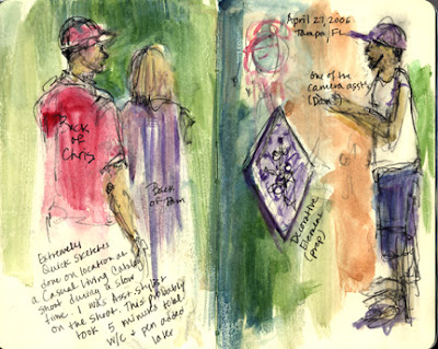
I have included a few examples of a few sketches I have done in public places. As these are not, don't expect masterpieces when you are out sketching in public. You will be moving fast, and the purpose is the PROCESS, not the product. The sketch at the top of the page was done in less than ten minutes total while I was on a job and I had a quick break. Another sketch (just below it) doesn't have any people or animals in it, but was something to do while I waited in an empty waiting room prior to an appointment, and the last sketch (at the bottom of the post) was done at a family gathering, so it was only a little "in public"-a good starting point if you are nervous about sketching in public. Animals move a lot, so it is also good practice to work with them, because you never know when they will change positions, which keeps you on your toes and working quickly.

Learn to take your sketchbook with you EVERYWHERE! You will be so surprised at the times you will have to sketch in public, and the 15 minute bits of time that will present yourself an opportunity to draw. The more you draw, the better you will get!

If you are shy at first about sketching in public, sit in your parked car and observe people out of the window. Try sketching that way first. But don't wait too long before going out in public to sketch. You will love the practice and the whole idea of sketching unobserved. Be a "secret agent" for art!

Saturday, February 17, 2007

Drawing Blindly- Yikes!


The mini-challenge for today is to make a blind-contour drawing in your sketch journal.

Yes- take your minds back to your high school art classes.... do you remember this technique? Here's Wikipedia's definition of blind-contour drawing on the Answers.com site, and it's actually pretty good:
blind contour drawing

Blind contour drawing is a method of drawing popularized by Kimon Nicolaïdes in his book The Natural Way to Draw (1941), which presents itself as an effective training aid or discipline. The student, fixing their eyes on the outline of the model or object, draws the contour very slowly in a steady, continuous line without lifting the pencil or looking at the paper. The student may look at the paper to place an internal feature, but once they begin to draw it, they do not glance down, but follows the same procedure as for the outline. A well-done blind contour drawing frequently has sufficient quality and character to be preserved as a work of art.

The practice is still commonly taught today in both high school and college art courses.

References

* Nicolaïdes, Kimon (1941). The Natural Way to Draw. Houghton Mifflin Company Boston. ISBN 0-395-08048-.
This entry is from Wikipedia, the leading user-contributed encyclopedia. It may not have been reviewed by professional editors


I like to use the technique called Modified Blind Contour. For the most part, I do not look at what I am drawing while I am drawing it, but if I need to pick up my pen and move to another area, I momentarily look at my page, only to reposition the pen. I try to only reposition a couple of times in the whole drawing...

The top mixed media piece, "Funky Vermeer," was first done as a modified blind contour drawing, then watercolor was added, and then collage elements and embellishments. Because of the 3-D aspects of the embellishments, adding this type of work to an art journal might be difficult, but it is included to show you the kinds of things you can do with blind-contour pieces.

Blind Contour drawings tend to take on a humorous quality because of the crazy proportions that result. Learn to love this- life is all about having a great time anyway, isn't it?!

Please share your work and/or experiences, and post a comment here. I'd love to hear what you are up to with all of this.

Friday, February 16, 2007

Sketch a Landscape


I know- most of you are freezing your tuckuses off right now, and my suggestion to "sketch a landscape" might sound daunting and unappealing this morning, depending on the type of weather you are experiencing in your part of the world, but- I promise- you can stay inside and sketch from a window or work from one of your photographs, either taken today or during a sunnier time and you will love adding a landscape to your sketchbook.

If you like, you can write in your sketch journal about your daydreams of being in a warmer climate today, or choose to revel in the cold and the snow, and sketch a winter day scene. Whatever your mood today, sketch a landscape that goes along with your mood

It is always a great idea to sketch from life if you can, because you can translate more that just what you see onto your journal page. Other senses become involved and become part of your impression of the scene when you are experiencing it in real life. The sketches and mini-paintings you see surrounding this post were all done at various places and times in different sketchbooks. Some are from life and some are from photographs. I tried to include a variety of approaches and media here- pen and watercolor, acrylics, and pastels. Also, some are more literal and others are more abstract. Try your hand at different approaches!

If you are working from a photograph, try to feel the mood you are getting from the scene first. Don't just try and replicate the scene- try and make it YOUR view, YOUR feeling of the landscape, and bring that out in how you make your strokes, how simple or complex you make your sketch and which colors you choose to work with.

So, sketch a landscape, and see how yours turns out today.

Share your work and experiences by including a comment!

Thursday, February 15, 2007

Collage In Your Sketchbook


The mini-challenge for today is to think about incorporating collage elements into your sketchbook.

Collage can be an art form in and of itself, so you could include an entire page devoted to collage, but in the example above, you will see how I added a few collaged pieces of patterned tissue to a drawing I had done in one of my Moleskine sketchbooks. When I finished the original sketches (notice frames were used, like we talked about yesterday), the page looked really bland and uninviting, so a few days later, I went back to the page and used white glue and tissue to add the bits of color and design elements. In this case, the collage helped save a totally dull page and helped make it better.

Another idea for collage is to pick up a few "finds" as you go through your day- receipts, a coffee stirrer, a dime you find in a parking lot, a business card or tickets... and make a collage with these items. It might be fun to use text too, to talk about what you were doing when you found the items. Be imaginative! Collage can be a fun alternative technique to drawing and painting in your sketchbook.

Share your work and experiences by leaving a comment!

Wednesday, February 14, 2007

Frame it Up!


This morning's mini-challenge is to put frames around your sketches.

Setting your artwork apart from the borders of the page makes it look finished and important, and adds a graphic design element, which creates interesting art journal pages.

Before you begin your artwork, think about a layout for the frames on your page. You can use any shape,(even a heart for Valentine's Day!) but rectangles are pleasing to the eye and are easy to draw. Do not use a ruler! You want imperfect frames, so that they fit in better with the look of your sketches. You can hold your pen or pencil as you usually do, but use the pinky and ring finger to slide along the edge of your sketchbook or journal as a guide to draw the straight sides of the rectangles. This gives you a fairly straight edge, but retains the look of being hand-drawn.

You can use more than one frame on a page, if you wish, and add text or simply put a frame around the place where you will add a sketch.

The example above was done a few years ago in a watercolor journaling workshop I attended. We drew the frames in, did a light pencil sketch inside the frame, and then used an archival pen (like the Micron Pigma .05) to ink the outlines, and then added watercolor washes to color it in.

The brand of the aketchbook is called Komtrack. It is a unique type of book that has a spiral that can be removed, and many types of papers can be put back in. I have one that is half watercolor paper, and half paper that is good for drawing on.

Whatever your paper or sketchbook, using frames is a really good idea to try!

Tuesday, February 13, 2007

Art Journal Update


I went ahead and did the Art and Letters challenge (see previous post), so that I could talk about the attitude toward the process while I was working on it.

First, let me say, that there were quite a few times I hated what I came up with, and other moments where I liked it very much. I feel pretty sure that a lot of you might vacillate between the love/hate relationship with your work as well. Am I right?

Anyway, I took a few shots along the way to give you an idea of how this progressed. The finished two-page spread in my Moleskine Sketchbook (shown above) took about 50 minutes. The graphite drawing (shown below with other pics) was done in 10 minutes, the first wash 10 more, adding watercolor pencil about 15 minutes, adding more watercolor pencil (dry this time) 10 more, and the last 5 minutes were spent journaling.

I ran up against some stumbling blocks- the paper got too wet from the washes, and I even made a hole in the page near the coffee cup, but my attitude is just that anything I do can be fixed or covered up. It is not a big deal. Here are some of the other pictures of the work-in-progress:


Art and Letters


Here is a great example of the Art and Letters challenge, submitted by Sandy W. of Charleston, SC. Thank you, Sandy!


Today we will start actually working in our art journals together.

The mini-challenge for today is called Art and Letters, because you will be using both art and text together to create an interesting page.

Today, think about creating a page that features something that you use just about every day, and may take for granted a little. Sketch it or paint a little picture of it in your art journal and write a tribute to it that you incorporate into the page.

The object that you will draw can be any object at all, but let's use the example, "Ode to my Coffee Cup," since a lot of people might want to try this.

You can elaborate on why this lowly cup is rarely thought about, but has such an important job to do- bringing you the caffeine buzz that you need to start your day! Whether it is a coffee mug, a paper cup with the obligatory cardboard sleeve, an insulated carafe or something else, it is usually ignored most of the time, but takes on a new life as you warm your hands around it and sip its lovely contents.

Make a title that you write in larger text and maybe embellish a little with color (colored pencils, pens or paint) or keep it really simple if you like. Just think about incorporating your own handwriting with your little sketch in an interesting way.

If you really hate your handwriting, don't worry, you will have lots of practice if you keep working in this type of art journal. Slow your writing down a little and pay attention to keeping it neater than, say, you might when jotting a note down at work, You might even consider printing instead- just experiment a little, and don't get hung up on it.

You have nothing to lose! It is only a little book with paper pages, and a small time investment to make the sketch. Spend anywhere from 15 minutes to an hour on this- no more. It shouldn't feel like it takes a lot of time, or you might begin to make excuses why you don't have time today, and YOU DO HAVE THE TIME. Fifteen minutes! Just do it!! You'll be glad you did.

Monday, February 12, 2007

More on the Moleskine Sketchbooks

If any of you are wondering exactly what a Moleskine sketchbook looks like, here is a photo:


The "large" sketchbook is 8.25" (21cm) tall by 5.25" (13.5cm) wide, and has a black hard cover. Inside the back cover of the sketchbook is a cool little expandable pocket to stuff notes and things you collect along the way.

I also like the elastic band that keeps the book closed. It is especially useful if you are carrying it with other art supplies (or just your regular stuff) in a bag or backpack.

Today I have a "virgin" Moleskine, but tomorrow, I will begin drawing and writing in mine, as I hope you all do. Check back in the AM for the first idea a.k.a challenge.

PS: No moles lost their skins in the making of this sketchbook! The company that makes them was originally Italian and they pronounce it mole-uh-SKEE-nuh.

I have also heard a lot of good things about the quality of the Raffine' sketchbooks, as well.

Weekly Art Theme #1- Keeping an Illustrated Journal


You can call it an illustrated journal, an art journal, a sketch journal or sketchbook- all of these describe the book that you will be using for your work, but after you work in it for a while, you will find your book transform into something so much more than just a sketchbook. It will become a wonderful compilation of your creative self, using your art, tidbits of things you collect that inspire you, and your own journaling about the process or whatever is on your mind that day.

You will first need to purchase or begin using an unwritten-in, unlined sketchbook to devote to your illustrated journal. You can buy any brand you like, but look for one that opens flat when you work in it, so that you can work across both pages to make larger sketches. I like ones that are bound, rather than the spiral type, because you can draw without running into the spirals. Just check the bound types to make sure that they are easy to open completely flat.

My favorite type of book for this is the Moleskine brand large sketchbook. They can be purchased in most of the larger bookstore chains- (you know- the ones with the cafes and WiFi)....The size of this journal is compact and easy to carry along, and opens completely flat. The other great thing about these is that you cannot tear out the pages!! Yes- you heard me right! You do not want to discard any of your work along the way, because we are not perfect people. We are not art robots! When you make something that you think looks weird- write something funny about it in your journal or collage on it or add paint- transform it! You will become more creative if you don't let your internal editor get the best of you. This is about freeing you up to be creative. You can keep your art journal private or show it to everyone you know. It will be much more authentic if you let your work stay there and grow. So if you don't like how something came out, look at it the next day with fresh eyes and do something different to it, until you like it, or just let it be as a little record of how you were in that moment.

Another fun thing about Moleskine journals is that there is also a whole culture of devotees who are crazy about using that brand of journal, so it is fun to search on the internet and check out how other people are using their Moleskines. But, I digress- use any darn brand you wish- the important part of this is that you actually work in your sketchbook as much as possible. If you work in it daily, it will totally transform how you think about life and art and become part of who you are, but any work in it is valuable- just do it!!

So go get yourself a sketchbook today, if you can, and go ahead and draw or write something in it! Tomorrow, and the rest of the week, I will give you a new little idea each day about the work you can do in your new art journal. I know you will enjoy trying this.

Sunday, February 11, 2007

Weekly Art Themes


Beginning tomorrow morning (Monday, February 11, 2007), I will begin posting the weekly art themes to the Art Inspiration Every Day blog.

Some weeks will feature themes that are art concepts (like value or composition), and other weeks will involve a project to begin or complete, with daily steps as the posted daily challenges.

If you are too busy to check in every day, just participate whenever you can. If you subscribe to the blog as an RSS feed (Atom), you can read through the challenges at your leisure, and choose the ones that you would enjoy the most or can make the time to do.

The more you can participate in the art themes and challenges, the more creative you will become. The goal is to make art a part of your daily life, even if you only have fifteen minutes a day to work the challenges! Imagine how much more creative and confident you will be with your work if you devote a bit of time every day to being artistic.

I hope you'll enjoy the weekly art themes and associated challenges. Look for them starting tomorrow!

Saturday, February 10, 2007

Art Inspiration Every Day- A new art blog

This blog will be about making art and working creatively every day.

I will be posting new art themes every week, with different mini-challenges on the general theme which will be added every day. Are you looking for a little nudge to get you moving in the right direction and get you working more creatively? Check in daily, and read my blog for a little art inspiration every day!

Have you wanted to try new materials or techniques to make your work more interesting or to help open you up more to the creative process? I will also be posting articles with illustrated tutorials that will help you follow along with more confidence, and will reveal new processes that you will love!

I highly recommend the practice of keeping an art journal to record your sketches, favorite writings, and your own journaling about your feelings and experiences which relate to art and life in general. I will help you get started keeping an art journal, with articles related to the practice.

An illustrated journal is highly personal and can be very powerful for many reasons- it can be a great way to keep your work together, watch your art skills increase, and create ideas that can later turn into more developed work. You will definitely find art inspiration every day if you begin spending a little time with your journal. It is a very rewarding practice.

I will be posting new weekly themes to the blog every Monday morning before 11:30 AM EST, USA. Daily challenges will also be posted before 11:30 AM EST, USA, each day. Check back on the weekends- I will post at least once each weekend, and sometimes both days, depending on what is happening that particular weekend, but need to be a little more flexible on when and which day of the weekend.

I hope you will enjoy starting this adventure with me as we look for a little art inspiration every day together!