Showing posts with label sketchbook. Show all posts

Wednesday, March 7, 2007

Doodle Like the Masters!

Pablo Picasso. (Spanish, 1881-1973). The Kitchen. Paris, November 1948. Oil on canvas, 69" x 8' 2 1/2" (175.3 x 250 cm). Acquired through the Nelson A. Rockefeller Bequest. © 2007 Estate of Pablo Picasso / Artists Rights Society (ARS),Museum of Modern Art, New York


OK, I mean no disrespect by the title of this post, but some of the most influential artists of the 20th century created certain pieces that look like they might have been thoughtful doodles. What I mean by "thoughtful" doodles, is that they are not haphazard or mindless, and make great use of the space of the page/canvas, but they still retain fun and whimsey, which I think is what makes the doodling process so appealing. I thought it would be great today to give ourselves "permission" to doodle in our sketchbooks!

I was surprised to come across the Picasso piece shown above, which I found in the collection of the Museum of Modern Art online, and thought I'd share with you here. In this piece, titled The Kitchen, you can clearly see the influence of Paul Klee and perhaps Miro in the simple whimsical linework, and the flourishes.
Look at this piece below, by Paul Klee, and note the similarities- the great use of space, a wonderful integration between the negative space of the background, and the positive space of his design:
Paul Klee. (German, born Switzerland. 1879-1940). Heroic Strokes of the Bow. 1938. Colored paste on newspaper on dyed cotton fabric on board, 28 3/4 x 20 7/8" (73 x 53 cm). Nelson A. Rockefeller Bequest. © 2007 Artists Rights Society (ARS), New York / VG Bild-Kunst, Bonn

On view at MoMA

Here is another piece by Klee, titled Twittering Machine. Notice the similar little shapes and flourishes to the Picasso piece at the top of the page.
Paul Klee. (German, born Switzerland. 1879-1940). Twittering Machine. 1922. Transfer drawing with oil, ink, and watercolor on paper on board with gouache, ink, and pencil, 25 1/4 x 19" (63.8 x 48.1 cm). Purchase. © 2007 Artists Rights Society (ARS), New York / VG Bild-Kunst, Bonn, Museum of Modern Art, New York


Finally, my last example to share with you is one of Joan Miro's paintings, titled The Escape Ladder. Again, there are similar shapes and a similar "feel" to the Picasso and the second Klee shown.
Joan Miró. (Spanish, 1893-1983). The Escape Ladder. (1940). Gouache, watercolor and ink on paper, 15 3/4 x 18 3/4" (40.0 x 47.6 cm). Helen Acheson Bequest. © 2007 Successió Miró / Artists Rights Society (ARS), New York / ADAGP, Paris, Museum of Modern Art, New York

What will your doodles look like if you do them with the intention of making the page interesting as a whole? Why don't you try it today in your art journal, and see what you come up with. Everybody has time to doodle. Right??

Monday, March 5, 2007

Weekly Theme- Learn from the Masters


Today starts the beginning of a new theme! I thought it would be fun to go back to our sketchbooks this week, and look at the work of a particular artist each day, trying out some of their techniques in our own work. What works in their art, and what doesn't? You are the master now, so take the things you like and leave the rest!

I just watched a documentary last night on Ovation- the arts cable station. It focused on the friendship that grew between Picasso and Matisse, and I was reminded of Matisse and the Fauve movement. Since we are just coming off of a week spent examining what contributes to "life" in art, I thought it wold be fun to look at a Fauve painter first. They were known as the "wild beasts" and definitely knew how to stir some vibrancy into their work! Perhaps we can follow in their footsteps today.

I found one painting by Maurice Vlaminck- the wildest beast of all-in the Wikipedia Commons, a public domain collection of 10,000 works of art. The painting above, titled The Circus, by Maurice Vlaminck, is a typical Fauve work- bright, crazy color, big daubs of paint, and an energistic delivery. Here is a link to another great painting of Vlaminck to illustrate his technique. It is even more colorful than The Circus, but since I am not sure of the copyright status, I will link you there to take a look.

I thought today, you might like to start off the week by painting or drawing in the Fauve style- go grazy with the color! Make big blobby strokes and broad areas of color! Add decorative flourishes! But don't lose sight of the strength of a good composition, and the ways the light and dark areas interact.

I sooooo wanted to participate in the WDE on Wetcanvas! yesterday, but got too involved with some art that I need to turn in for a show by Wednesday this week, and didn't get to it (boo hoo, sniff sniff). But I am devoting 30 minutes today to interpreting one of the WDE photos offered this week, and will pretend I am a Fauve while doing it- AND I will upload it to the post to share with you here and on the WDE forum as well. How about you? What will you work on today?

If you have some artwork that you'd like me to share here, just use the contact form on the right to let me know about it, and I will get back in touch and tell you how to get it to me. I set up the contact form to keep the automated spammers away, but I don't want to keep YOU away, and I'd love to see your work. If you agree, I'd also love to post it here in a related topic for others to see and be inspired by it.

I hope you have fun with this jaunt with the Fauves today. Just do something bold and quick. The idea is to do something every day if you can, to keep art an integral part of your life. Don't labor over it, just make it a fun and easy sketch or quick painting!

Now, I'm off to do MY Fauve painting......

Tuesday, February 27, 2007

Study First!


Today, I'd like to share a little bit with you about the value of doing studies before beginning a painting or drawing that you will be investing a longer amount of time developing.

Don't worry, it is not nearly as painful as getting ready for an exam! It's actually fun, believe it or not, and a great day to get your creative ideas flowing. In addition to looking at the values that are already apparent in a scene, you can add and change values around so that they look even BETTER than what you are actually seeing. It is one of the great things about being an artist. YOU get to choose how to portray your vision.

Studies are great to do in your sketchbook or art journal. I usually start with a value study that is true to the scene- blocking in the range of lights and darks that I actually see, in large areas first- no detail at this stage.

These types of studies can be quick or more developed, but I generally spend between five and fifteen minutes on a basic value study. It is just a tool, and not generally very striking on its own.

Next, I will do a second value study, but this time, will edit reality to my liking. I might add some additional dark areas to balance out the composition, or move things a round a bit. It is a little like making a map at this point, and you are moving puzzle pieces around until you like what you see.

Once I get to that point, I will do a bit more detailed value and developed gesture drawing of the scene, like you see above (about 30 to 45 minutes, give or take). We will begin going into the power of gesture tomorrow, but for now, look at the values in the drawing, and how they relate to the final watercolor painting below.

I am out all morning today, but when I return, I will try to locate my original value sketches for this painting, so that you can see what they looked like in the early stages, or I will re-create them for you and revise the post. This will get you going for now.

Why don't you take something you'd like to paint or draw and try the techniques described above as a way to start. There are two reasons why this tends to keep life in your work- first, you are really looking at the full range of lights and darks and are beginning to use them to your advantage as you plan your painting. Secondly, after you have drawn the scene a few different ways, your brain relaxes, and you can get right to the creative part when you begin the actual painting.

Try this, and I think you'll find that "study"ing (in art) really pays off!

Sunday, February 18, 2007

Sketching In Public- Be a Secret Agent for Art!


Today's mini-challenge in the Art Inspiration Every Day blog is to try your hand at sketching in public. This is the final mini-challenge our our week devoted to creating and keeping an art journal. Tune in tomorrow for a whole new weekly theme!

I hope that you have decided that keeping an art journal is a beneficial practice, and will continue to work in your art journal as we explore new weekly themes and daily challenges. You may want to do future challenges (or as many challenges as you are able) in your new sketch journal that we have begun together this past week. If you are just joining in, just start with us wherever we are. You can go back later and try some of the past themes and challenges as you wish, but don't get hung up on doing it all. The idea is just to start in wherever we are, and you will begin to make art a part of your daily life as you move forward with the exercises.

Sketching in public is a great way to fit art in with your usual daily routine. Sketching in public can happen anywhere- at a coffeeshop, restaurant or food court, at an outdoor event (like a market or festival), in your car when you are waiting to meet someone or even just sitting on a bench at the park.

I usually like to sketch unobserved, so will share my tricks with you to remain anonymous. I like my "sketching in public" sketchbook to be small and to look like a regular book. That way, people will just assume that I am reading or writing in a journal and will not become self-conscious, like they might if they knew that I was drawing them. I also take a small drawing kit with me, which contains a Conte' pencil, a regular drawing pencil as well as a water-soluble drawing pencil, a Pigma Micron .05 pen or similar, and an eraser.

Depending on where I am and what I think I can get away with, I might even add watercolor washes while I am there, or at least add a bit of water to a sketch where I have utilized a water-soluble graphite pencil for the drawing. For this, you need a handy-dandy travel brush (which you can find at the larger art stores- try Dick Blick, Daniel Smith or Jerry's Artarama, and search for "travel brush."

A pocket-style watercolor palette is great to have, as well. Some travel watercolor sets even have a little container included for water. I know that Winsor-Newton makes a nice one, and as an alternative, you can make your own if you buy a empty plastic palette and fill with the tube watercolors. (Just make sure you let the paints dry in the pan sections for a few days before folding it up and taking it out with you, or you will have a mess!)

Select a place to sit where you can blend in with the background. If you are going to sketch in a coffee shop, choose a table along the wall or in a corner, preferably a few tables away from others. Make sure you order something, and wait a few minutes before you pull out your gear. Take out only your sketchbook and one writing instrument. If you get the cap-style eraser, you can stick the eraser right on the end of your drawing pencil, so that you don't have to have a lot of things out on your table to draw attention to you.

Try to begin sketching the entire scene, paying NO attention to detail at first. People will move, so just sketch the form in quickly and add detail as you have time. That way, if they get up and walk away, you will still have something that looks pretty good. If you start working on the eye for five minutes, after you have sketched in the whole scene, you will end up with a weird-looking drawing of a loosely sketched person with one detailed eye, so the idea is to build up the detail in your sketch fairly uniformly. Once your sketch is to a certain point, if the person is still there, you can decide to make a focal point of their hands or face, and put more detail your area of choice, but wait until your drawing has enough detail overall before zooming in on an area to detail. As I have mentioned in past posts, write some info about your scene, your mood, the date or a bit of prose or poetry near your sketches that you have made in public.

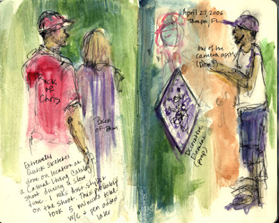
I have included a few examples of a few sketches I have done in public places. As these are not, don't expect masterpieces when you are out sketching in public. You will be moving fast, and the purpose is the PROCESS, not the product. The sketch at the top of the page was done in less than ten minutes total while I was on a job and I had a quick break. Another sketch (just below it) doesn't have any people or animals in it, but was something to do while I waited in an empty waiting room prior to an appointment, and the last sketch (at the bottom of the post) was done at a family gathering, so it was only a little "in public"-a good starting point if you are nervous about sketching in public. Animals move a lot, so it is also good practice to work with them, because you never know when they will change positions, which keeps you on your toes and working quickly.

Learn to take your sketchbook with you EVERYWHERE! You will be so surprised at the times you will have to sketch in public, and the 15 minute bits of time that will present yourself an opportunity to draw. The more you draw, the better you will get!

If you are shy at first about sketching in public, sit in your parked car and observe people out of the window. Try sketching that way first. But don't wait too long before going out in public to sketch. You will love the practice and the whole idea of sketching unobserved. Be a "secret agent" for art!

Friday, February 16, 2007

Sketch a Landscape


I know- most of you are freezing your tuckuses off right now, and my suggestion to "sketch a landscape" might sound daunting and unappealing this morning, depending on the type of weather you are experiencing in your part of the world, but- I promise- you can stay inside and sketch from a window or work from one of your photographs, either taken today or during a sunnier time and you will love adding a landscape to your sketchbook.

If you like, you can write in your sketch journal about your daydreams of being in a warmer climate today, or choose to revel in the cold and the snow, and sketch a winter day scene. Whatever your mood today, sketch a landscape that goes along with your mood

It is always a great idea to sketch from life if you can, because you can translate more that just what you see onto your journal page. Other senses become involved and become part of your impression of the scene when you are experiencing it in real life. The sketches and mini-paintings you see surrounding this post were all done at various places and times in different sketchbooks. Some are from life and some are from photographs. I tried to include a variety of approaches and media here- pen and watercolor, acrylics, and pastels. Also, some are more literal and others are more abstract. Try your hand at different approaches!

If you are working from a photograph, try to feel the mood you are getting from the scene first. Don't just try and replicate the scene- try and make it YOUR view, YOUR feeling of the landscape, and bring that out in how you make your strokes, how simple or complex you make your sketch and which colors you choose to work with.

So, sketch a landscape, and see how yours turns out today.

Share your work and experiences by including a comment!

Thursday, February 15, 2007

Collage In Your Sketchbook


The mini-challenge for today is to think about incorporating collage elements into your sketchbook.

Collage can be an art form in and of itself, so you could include an entire page devoted to collage, but in the example above, you will see how I added a few collaged pieces of patterned tissue to a drawing I had done in one of my Moleskine sketchbooks. When I finished the original sketches (notice frames were used, like we talked about yesterday), the page looked really bland and uninviting, so a few days later, I went back to the page and used white glue and tissue to add the bits of color and design elements. In this case, the collage helped save a totally dull page and helped make it better.

Another idea for collage is to pick up a few "finds" as you go through your day- receipts, a coffee stirrer, a dime you find in a parking lot, a business card or tickets... and make a collage with these items. It might be fun to use text too, to talk about what you were doing when you found the items. Be imaginative! Collage can be a fun alternative technique to drawing and painting in your sketchbook.

Share your work and experiences by leaving a comment!

Wednesday, February 14, 2007

Frame it Up!


This morning's mini-challenge is to put frames around your sketches.

Setting your artwork apart from the borders of the page makes it look finished and important, and adds a graphic design element, which creates interesting art journal pages.

Before you begin your artwork, think about a layout for the frames on your page. You can use any shape,(even a heart for Valentine's Day!) but rectangles are pleasing to the eye and are easy to draw. Do not use a ruler! You want imperfect frames, so that they fit in better with the look of your sketches. You can hold your pen or pencil as you usually do, but use the pinky and ring finger to slide along the edge of your sketchbook or journal as a guide to draw the straight sides of the rectangles. This gives you a fairly straight edge, but retains the look of being hand-drawn.

You can use more than one frame on a page, if you wish, and add text or simply put a frame around the place where you will add a sketch.

The example above was done a few years ago in a watercolor journaling workshop I attended. We drew the frames in, did a light pencil sketch inside the frame, and then used an archival pen (like the Micron Pigma .05) to ink the outlines, and then added watercolor washes to color it in.

The brand of the aketchbook is called Komtrack. It is a unique type of book that has a spiral that can be removed, and many types of papers can be put back in. I have one that is half watercolor paper, and half paper that is good for drawing on.

Whatever your paper or sketchbook, using frames is a really good idea to try!

Tuesday, February 13, 2007

Art Journal Update


I went ahead and did the Art and Letters challenge (see previous post), so that I could talk about the attitude toward the process while I was working on it.

First, let me say, that there were quite a few times I hated what I came up with, and other moments where I liked it very much. I feel pretty sure that a lot of you might vacillate between the love/hate relationship with your work as well. Am I right?

Anyway, I took a few shots along the way to give you an idea of how this progressed. The finished two-page spread in my Moleskine Sketchbook (shown above) took about 50 minutes. The graphite drawing (shown below with other pics) was done in 10 minutes, the first wash 10 more, adding watercolor pencil about 15 minutes, adding more watercolor pencil (dry this time) 10 more, and the last 5 minutes were spent journaling.

I ran up against some stumbling blocks- the paper got too wet from the washes, and I even made a hole in the page near the coffee cup, but my attitude is just that anything I do can be fixed or covered up. It is not a big deal. Here are some of the other pictures of the work-in-progress:


Monday, February 12, 2007

More on the Moleskine Sketchbooks

If any of you are wondering exactly what a Moleskine sketchbook looks like, here is a photo:


The "large" sketchbook is 8.25" (21cm) tall by 5.25" (13.5cm) wide, and has a black hard cover. Inside the back cover of the sketchbook is a cool little expandable pocket to stuff notes and things you collect along the way.

I also like the elastic band that keeps the book closed. It is especially useful if you are carrying it with other art supplies (or just your regular stuff) in a bag or backpack.

Today I have a "virgin" Moleskine, but tomorrow, I will begin drawing and writing in mine, as I hope you all do. Check back in the AM for the first idea a.k.a challenge.

PS: No moles lost their skins in the making of this sketchbook! The company that makes them was originally Italian and they pronounce it mole-uh-SKEE-nuh.

I have also heard a lot of good things about the quality of the Raffine' sketchbooks, as well.